I started the year by making myself a concertina sketchbook, a structure that I’ve been thinking about making since roughly two years. It’s the simplest sketchbook that you can make — just tear your paper down into long strips, accordion fold them {which essentially is like pleating your paper} and you’re done! — and yet, it took me that long to actually get down to making one. But as they say, better late than never!
My plan is to use this sketchbook to explore the color blue. It’s one of my favorite colors and I use it in almost all of my paintings. At last count, I had around 16 tubes of blue in different shades, some of which I rarely use! It’s about time I remedied this.
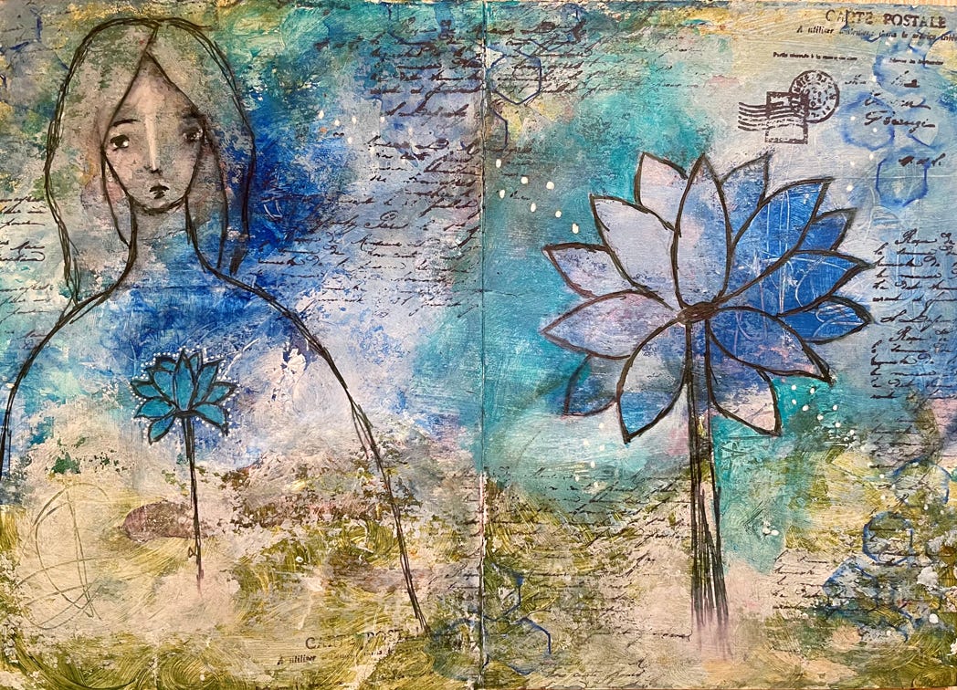
My initial few pages were simply focused on the blues — on working with different shades of blues and trying out a few different color combinations. I’m going to move in to more experimental color mixing and color combinations next.
For today, though, I’m sharing a few of my initial explorations with blue.
Invite some color into your mailbox! Receive notes on creative living, pages from my art journal, and short process videos in your inbox every Friday.
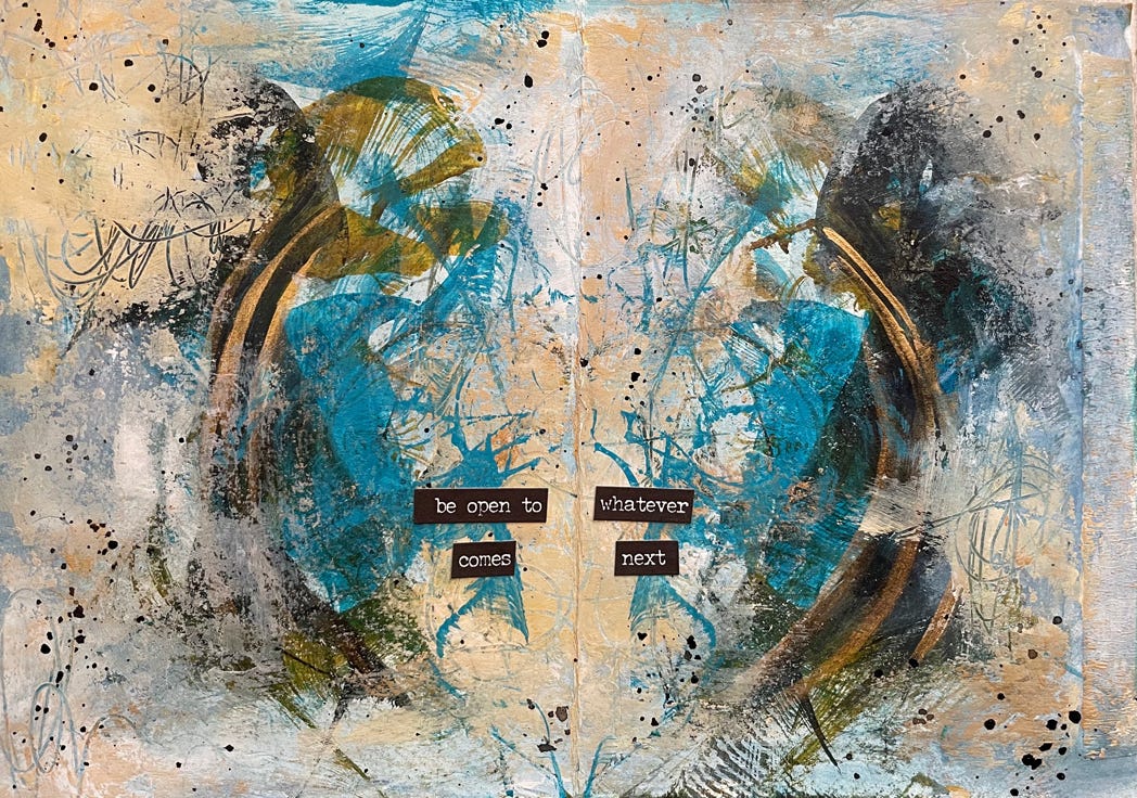
I love how this page turned out. The Payne’s Grey ink looks almost black, and adds some contrast to this otherwise largely neutral, abstract page.
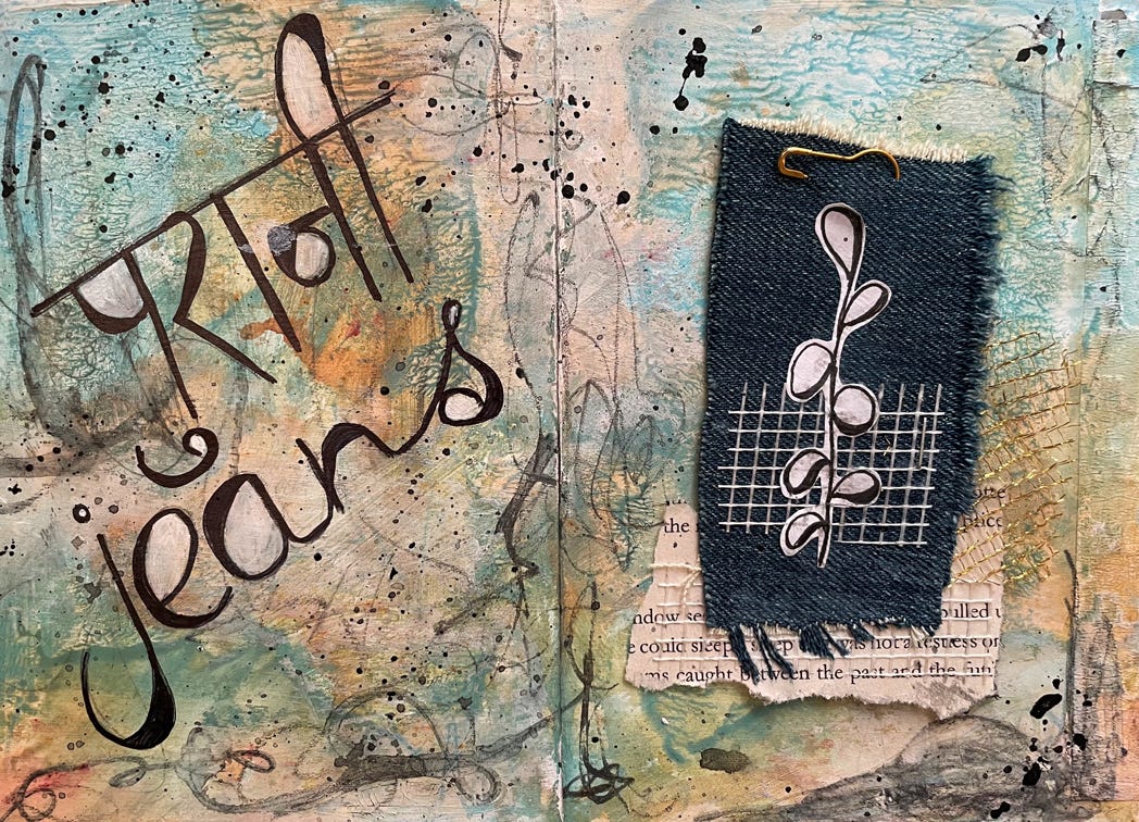
You can’t think about blue without immediately thinking about denim! I’m a jeans and t-shirt girl, so of course I had to include some denim in this sketchbook. While working on the collage on this piece of fabric from an old pair of jeans, I was reminded of a song from my teenage years called Purani Jeans {purani means old}, by Pakistani singer Ali Haider {you can listen to it on YouTube}. I decided to write the title in Hindi, and realized just how rusty my writing — and spellings — are. Thank goodness for Google! I think I should try and add more Hindi writing into my art journals….
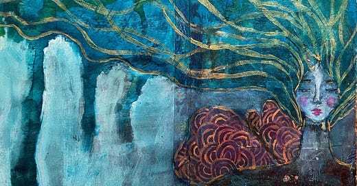
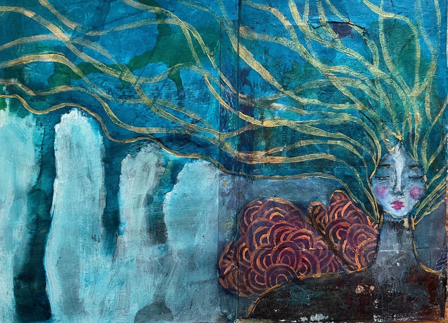
This one was a simple remembering of just how much I loved drips! There was a time when none of my paintings were complete without them. I also challenged myself to use just one shade of blue and change the tint to create some depth in the painting. I added a bit of green and purple towards the end for contrast. Adding in this golden lines and patterns was such a meditative process.
Here’s another page using a limited palette — turquoise blue, phtalo blue and orange, along with white and black. I quite love the gentleness on this page, and the sketchy drawings.
And finally, there is this riot of color! Inspired by all the painting sessions and vibrant color choices of my 3-year old niece, and my inner child! But still, the blue dominates and ties it all together rather beautifully, I think.
I hope you enjoyed this look into my concertina sketchbook. I still have quite a way to go before the sketchbook is filled up, and I have a few more color mixing experiments that I want to try. I will probably share some work-in-progress paintings from the sketchbook, and there will definitely be a flipthrough once it’s complete!
Which one of these paintings did you like the best? Tell me in the comments, or simply reply to this email.
Like this post? Share it with your friends and invite them into our virtual studio. There’s space for all of us here! If you’re on the Substack app, consider restacking this post to Notes.





I love the idea of dedicating a small book to a color and may have to give it a try. Beautiful work!
I love your use of colour.